
We put the FY 2025-26 covers of 23 Indian listed companies side by side, then shrank them to 120 pixels. ICICI Bank's single word, Zee's steel Z and LTM's coined verb survive the test. SBI's three-line slogan, Sun Pharma's stock photography and three near-identical blue AI covers don't. What works on an annual report cover, what fails, and a checklist for briefing your agency.
In this article
 In short
Key takeaways
- Single-idea covers outperform busy ones. ICICI Bank's cover is one word on a textured orange field; SBI's carries a three-line slogan, two logos, the bank's name in two scripts, a phone, four people, a snowbound branch and a city skyline.
- At 120 pixels wide, roughly the size of a search thumbnail, the theme lines of ICICI Bank, Zee, LTM, Hero MotoCorp, ITC and Infosys can still be read. Those of TCS, L&T, Adani Ports, Sun Pharma, JSW Steel, Hindustan Zinc and Dr. Reddy's can't.
- Three of the 23 cover lines name AI, and all three covers (TCS, Infosys, HDFC Bank) use the same deep-blue, glowing, digital palette. Cover the logos and they are hard to tell apart.
- The strongest images come from the company's own material or mark: JSW Steel's polished steel rings, Titan's faceted star, Zee's brushed-steel 'Z', ITC's and Airtel's logos used as windows, Britannia's giant 'B'.
- Adani Ports and Adani Enterprises print the same cover line, 'Accelerating Infrastructure, Leveraging Intelligence', so neither can claim it as its own.
- ITC's cover carries 'Enduring Value', the line that also signs its back cover, while the year's theme ('Building a Future-Forward Enterprise for a Viksit Bharat') appears only inside. The cover becomes a brand signature, not a statement about the year.
- Few covers make the reporting year easy to find. On most it sits in small type at the bottom, and at thumbnail size almost none can be read. Dr. Reddy's is the exception: 'FY 2025-26' is set large and bold just below the company name.
Most people never open an annual report. They see its cover: as a thumbnail on the exchange filings page, as the image on a LinkedIn post, as the first frame of a PDF preview, on a stack of printed copies at the AGM. The cover has to say whose report it is, which year it covers and what the year was about, often at the size of a postage stamp.
We took the FY 2025-26 covers of 23 Indian listed companies across IT, banking, consumer goods, telecom, infrastructure, media, autos, pharma, mining and steel, and looked at each one at full size and at 120 pixels wide. Each image below is the cover page of the company's official PDF, from its investor website or its exchange filing, reduced in size and otherwise unaltered. All images are the copyright of the companies named and are reproduced here for commentary.
The short answer
room.FY 2025–26Annual Report
Check the actual reduced artwork, not only a large-screen concept. If a line disappears, simplify the hierarchy before adding another element.
Fictional demonstration in Albert Sans, not one of the 23 company covers. Previews are 240 and 120 CSS pixels wide at normal browser zoom; this is an editorial test, not an accessibility threshold.
A good cover makes one claim, in a line you can read from across a room, with an image that only that company could use. ICICI Bank, Zee Entertainment, LTM, JSW Steel, Titan and Hero MotoCorp manage this. The covers that fall short try to say several things at once, borrow imagery any company could print, or set the theme line so small or so long that it disappears when the cover shrinks.
What works
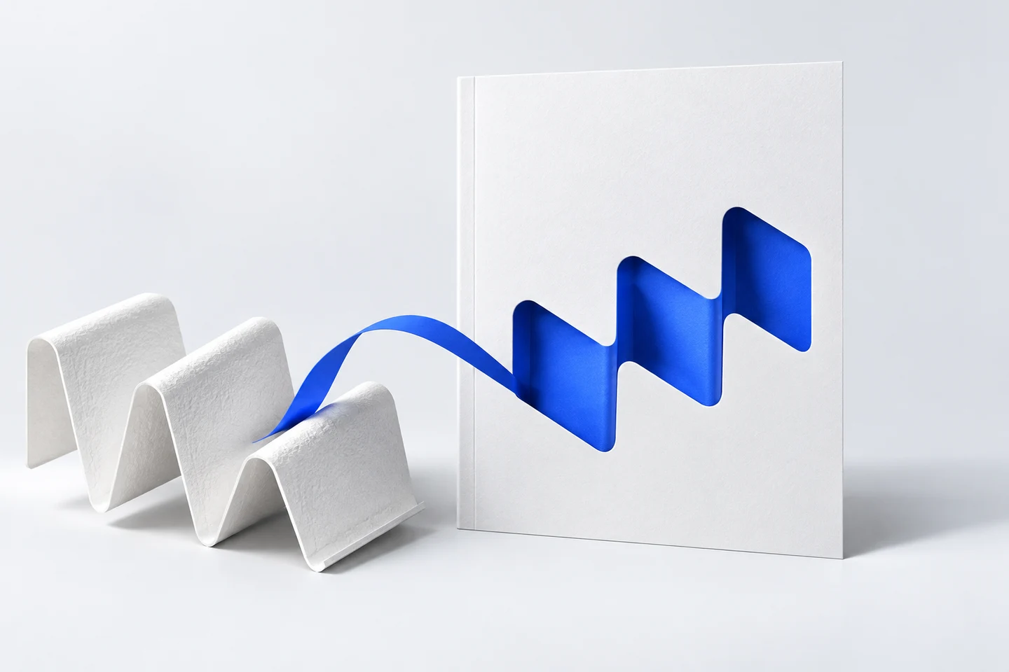
- Material or product
- Distinctive mark or letterform
- Archive, places or people
- A specific change in this reporting year
Could a competitor use this image and line with only its logo changed?
If yes, look for a more specific idea.
Invented conceptual cover, not an actual company example or a recommended design for a named business.
One idea. The covers that stay with you commit to a single thought. ICICI Bank's is a word. Hero MotoCorp's is "Future", in red capitals across the full width of the page. Mahindra's road running into fog is the line "Acceleration in Uncertainty" turned into a picture. None of them needs a subline to explain itself.
A theme that fits the company. JSW Steel's "A Different Mettle" is a pun that only works for a metals company, and the picture is steel. Titan's faceted star is its own logo, splitting light into colour beside the line "Fuelled by Ideas. Scaling Frontiers." TCS's stacked isometric layers run from chips at the bottom to robots and a car at the top, which is literally "Infrastructure to Intelligence". When the image and the line describe the same thing, the reader doesn't have to work.
Clear typographic hierarchy. LTM's cover has three levels and no more: a small lead-in ("It's time to"), one very large coined word ("Outcreate"), and the report name. Infosys builds "AI" into the title itself, the I drawn as a door frame with light behind it. In both, you know what to read first.
Restraint. ICICI Bank, Zee and Titan leave most of the page empty. ITC puts its collage inside its logo shape and leaves the rest white. Empty space is what makes the one thing on the page look important.
Legibility as a thumbnail. This is the test most covers fail without anyone noticing, because covers are approved at full size on a large screen. We shrank all 23 to 120 pixels wide.
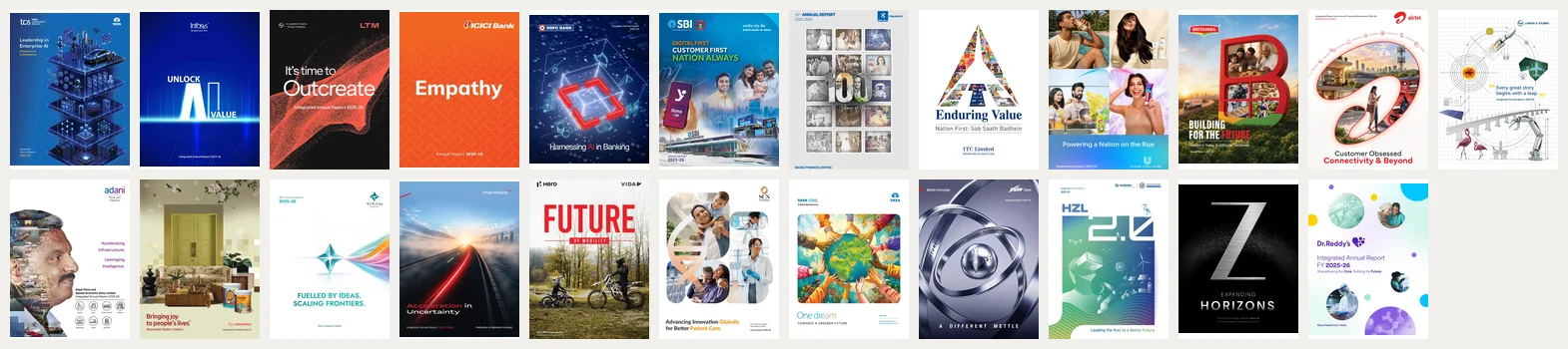
At that size the theme lines of ICICI Bank, Zee, LTM, Hero MotoCorp, ITC and Infosys can still be read. TCS's sits small in the top-left corner and is lost; so are L&T's, Adani Ports', Sun Pharma's and JSW Steel's, the last because widely letter-spaced capitals at the foot of a dark page turn into a grey line. Hindustan Zinc's "HZL 2.0" reads, but the actual theme line beneath it doesn't, and Dr. Reddy's name and year survive while its line does not. The reporting year is unreadable on almost all of them; Dr. Reddy's is the one clear exception.
A back cover that earns its place. The back is the last page of the PDF and the side of the printed report that faces up half the time. ITC's carries six QR codes, to its website, LinkedIn, YouTube, Instagram, a corporate communications WhatsApp channel and X. Titan's shows its brand portfolio, from Tanishq and CaratLane to Fastrack and Taneira. L&T's finishes the cover story in four lines ("It continues leap by leap"). Zee's back is black, with "Yours Truly," above a small steel Z, a sign-off that closes the report the way a letter closes. TCS uses its back cover for its safe harbour statement. Several of the PDFs we downloaded, including Mahindra's, Hero MotoCorp's and Britannia's, end on a notes page or an AGM table instead.
What fails
Imagery any company could use. A father with a child on his shoulders, a scientist at a microscope, a woman in safety glasses holding a tablet: Sun Pharma's cover could belong to any healthcare company in the world. Dr. Reddy's has the same problem in circular frames: a DNA strand, a nurse embracing a patient, a worker in protective gear. Tata Steel's painting of many hands holding up a globe is warmly done, but hands-around-the-globe is one of the most familiar images in corporate design, and there is no steel in it. HDFC Bank's glowing data cube, floating charts and coins is the visual shorthand for "AI" that every technology deck already uses.
The AI blue. Three of the 23 cover lines name AI (TCS, Infosys, HDFC Bank), and all three covers are deep blue, dark and luminous. Infosys distinguishes itself through typography. The other two rely on the logo to tell them apart.
Too many messages. SBI's cover has a three-line slogan in three colours ("Digital First / Customer First / Nation Always"), the SBI logo with its tagline, a second emblem, the bank's name in Hindi and English, a phone showing the YONO app, a call-centre agent, a family of three, a city skyline, an ATM and a snowbound branch in Tawang. Each element is defensible. Together they leave the eye nowhere to rest. Britannia pairs "Building for the Future" with a subline, "Rooted in Today. Building for Tomorrow.", that says "building" twice. Asian Paints carries a registered brand line, "Bringing joy to people's lives", plus a second line, "Responsible. Resilient. Radiant." Hindustan Zinc fills one panel with a VR headset, a robotic arm, a drone, an AI chip, wind turbines, solar panels, an electric car at a charger and a heron: every symbol of the future at once.
A line that isn't yours. Adani Ports' cover line, "Accelerating Infrastructure, Leveraging Intelligence.", also appears on Adani Enterprises' FY 2025-26 cover. A shared group message is a legitimate choice, but on the cover it means neither company is saying anything specific about its own year.
A hidden year. On most covers the financial year is the smallest piece of type on the page. Titan and Bajaj Finance put it at the top left, where a reader looks first. Dr. Reddy's does better still, setting "FY 2025-26" in large bold type just below its name. Most others tuck it at the bottom in a size that vanishes in a thumbnail.
The 23 covers, one by one
TCS
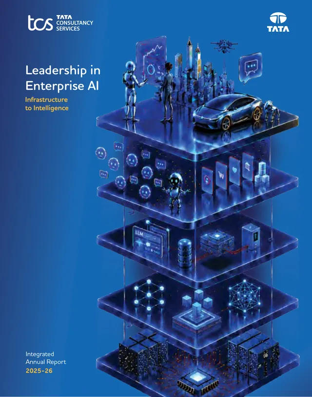
An isometric tower of glass floors climbs from chips and server racks at the base, through data and LLM layers, to robots, a drone and a car on top. It's the most literal cover in the set: the picture is the theme, bottom to top. The weakness is scale; "Leadership in Enterprise AI" is set small in the top-left corner and the picture does all the talking. Our TCS review shows how well the theme carries through the report.
Infosys
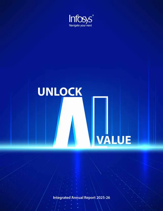
The title is the image: a large white "A" and an "I" drawn as an open door frame, between "Unlock" and "Value", on a blue floor of light. It's typographic, quick to read, and clever without being cute. It shares its palette with two other AI covers in this set, which costs it some distinctiveness. (Infosys review)
LTM
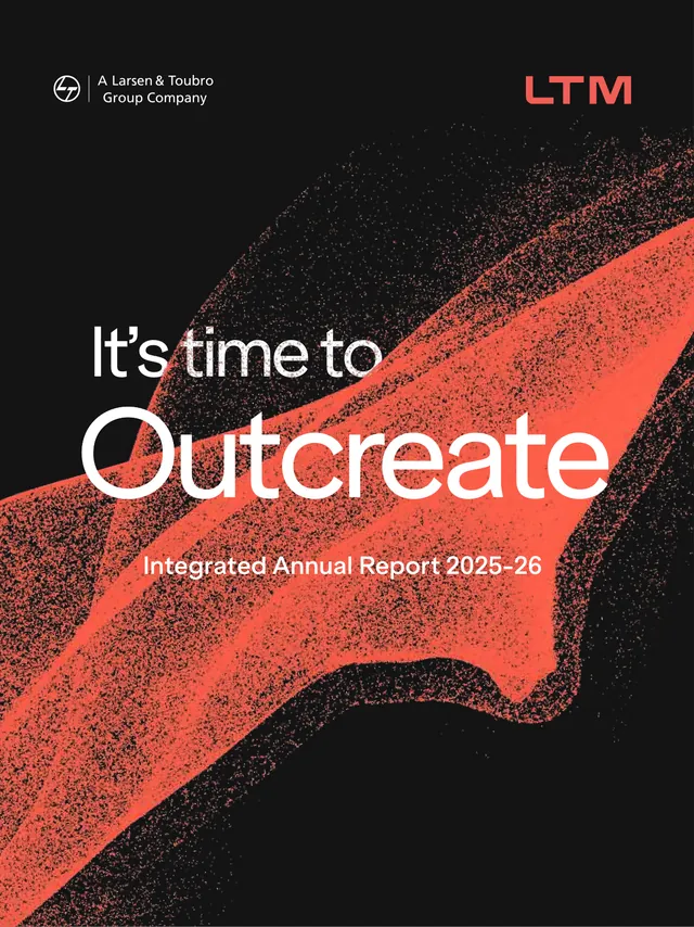
Black page, a red particle wave and one invented word, "Outcreate", in very large white type. The hierarchy is perfect: lead-in, word, report name. A coined word is a risk (readers have to accept it), but on a cover it works because nobody else can use it. (LTM review)
ICICI Bank
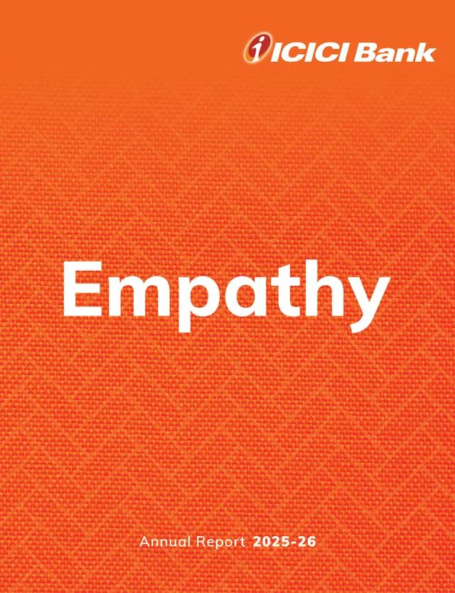
One word in white on the bank's orange, with a woven fabric texture and the logo top right. It's the best cover of the 20: instantly the bank's, readable at any size, and confident enough to leave the explaining to the opening spread, where "Empathy" is broken into six facets. The back cover repeats the orange texture, so the printed report reads as one object. (ICICI Bank review)
HDFC Bank
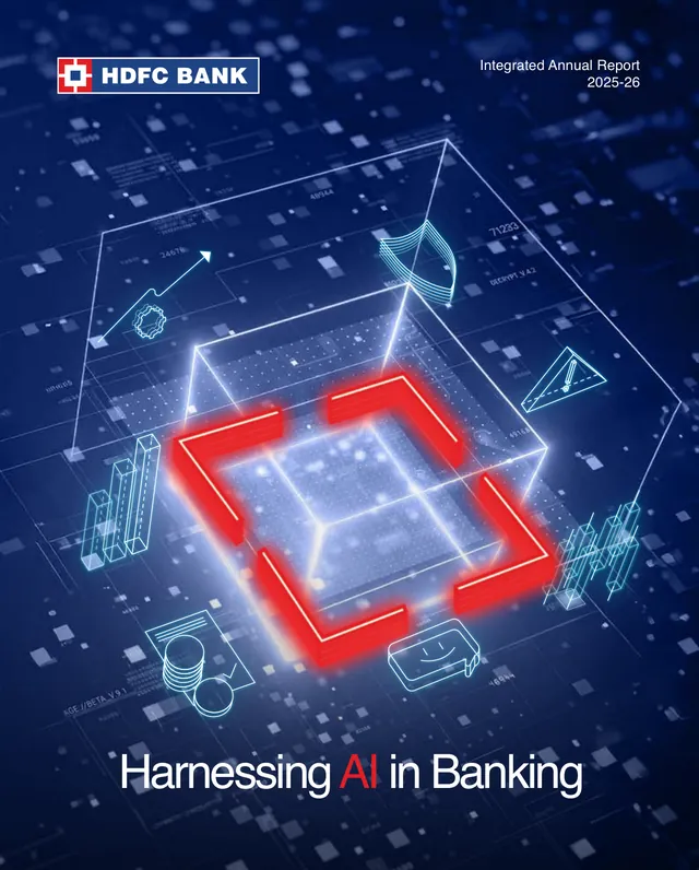
A wireframe cube on a dark blue grid, with glowing red corner brackets that echo the square in the bank's logo, surrounded by floating bar charts, coins and documents. The red brackets are a good, ownable idea. Everything around them is stock "digital" imagery, and the theme line at the bottom is the only thing that says "banking". (HDFC Bank review)
State Bank of India
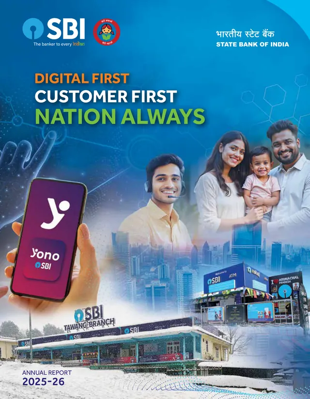
The busiest cover in the set: three slogan lines in orange, white and green, two emblems, the name in two scripts, the YONO app on a phone, four people, a skyline, an ATM and the Tawang branch in snow. The Tawang branch is a genuinely specific detail, and it's buried. Pick one of the three claims and one image, and this would be a strong cover. (SBI review)
Bajaj Finance
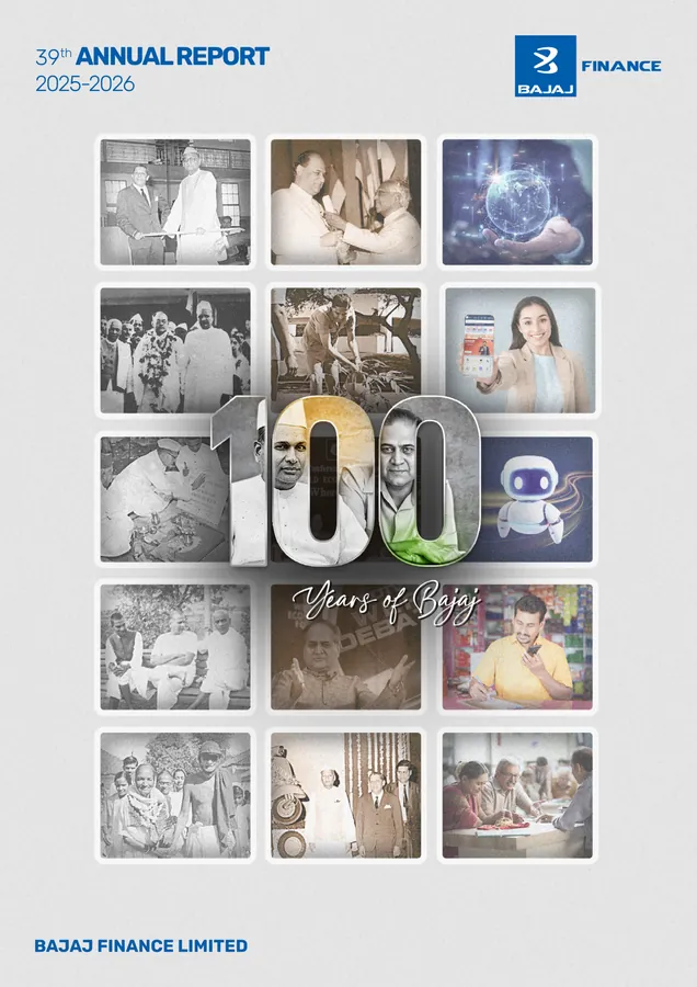
A grid of 15 photographs, mostly black-and-white archive images, with a large three-dimensional "100" and "Years of Bajaj" in script across the middle. The archive photographs are the cover's real asset; few companies have a century of them. Two numbers compete (the group's 100 years and the company's 39th report), and the tiles of a robot and a hand holding a glowing globe sit oddly among the history. (Bajaj Finance review)
ITC
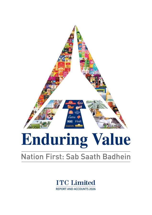
ITC's logo shape filled with a collage of its packs, brand names (Aashirvaad, Sunfeast, Bingo!, Fiama, Engage, Vivel, Classmate) and photographs of fields and factories, on a white page. It shows the breadth of the business in one shape, and it reads at any size. But "Enduring Value" is the line that also sits under the logo on the back cover, so the cover reads as a corporate signature rather than a statement about this year; the year's theme, "Building a Future-Forward Enterprise for a Viksit Bharat", appears only inside. (ITC review)
Hindustan Unilever

Four advertising-quality photographs (Bru, Dove, Vim and Closeup) in a grid above a blue band carrying the theme. It looks like HUL, and at thumbnail size the line survives. The photographs are product advertising, though, and none of them is about a nation on the rise; the image and the line are making two different points. (HUL review)
Britannia
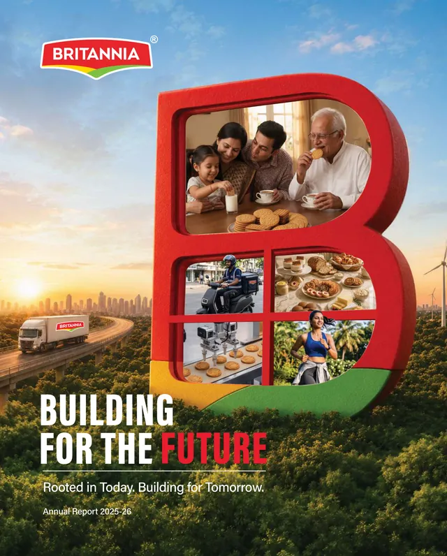
A giant red "B" in brand colours stands in a forest, its windows showing a family eating biscuits, a delivery rider, baked goods, automated production and a runner, with a Britannia truck, a skyline and wind turbines behind. Using the letterform as a frame is a strong, ownable idea. The scene around it is crowded, and the subline repeats the word "building".
Bharti Airtel
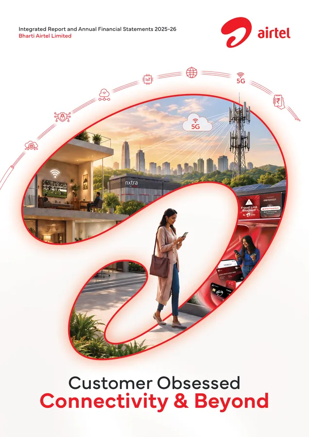
The Airtel swoosh becomes a window onto a city: a home with Wi-Fi, a 5G tower, an Nxtra data centre, a woman on her phone, a "Fraud Link Blocked" alert and a card, with a ring of service icons arcing above. Using the logo as the frame is the right instinct, and the two-line theme reads well. The window is packed with every business line at once, which makes it a diagram more than a picture. (Airtel review)
Larsen & Toubro
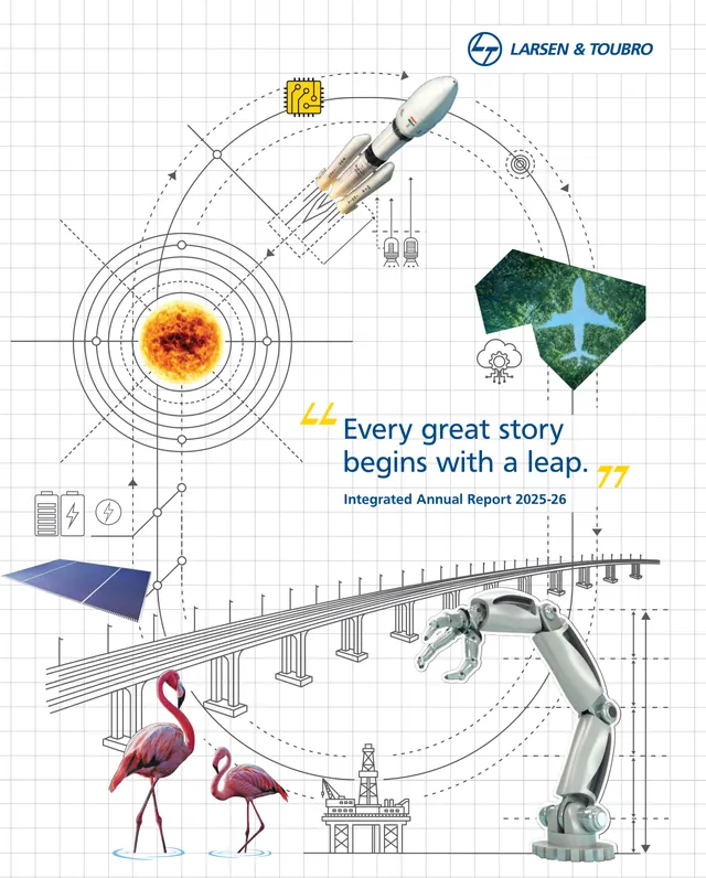
Engineering line drawings on graph paper, with photographic cut-outs: a rocket, a sun inside orbit rings, an aircraft over forest, a solar panel, a sea bridge, flamingos, an offshore platform and a robotic arm. The blueprint idea suits an engineering company and the back cover continues it. The quoted line is small and sits in the middle of a lot of objects, so it doesn't survive at thumbnail size. (L&T review)
Adani Ports
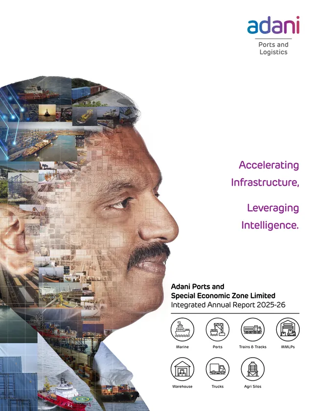
A man's face in profile, built from a mosaic of photographs of ships, cranes, rail and containers, with the theme in purple on the right and seven icons for the business lines below. The mosaic portrait is striking at full size and turns to texture at small size. The line is shared with Adani Enterprises, and the icon row is information that belongs on an inside page. (Adani Ports review)
Asian Paints
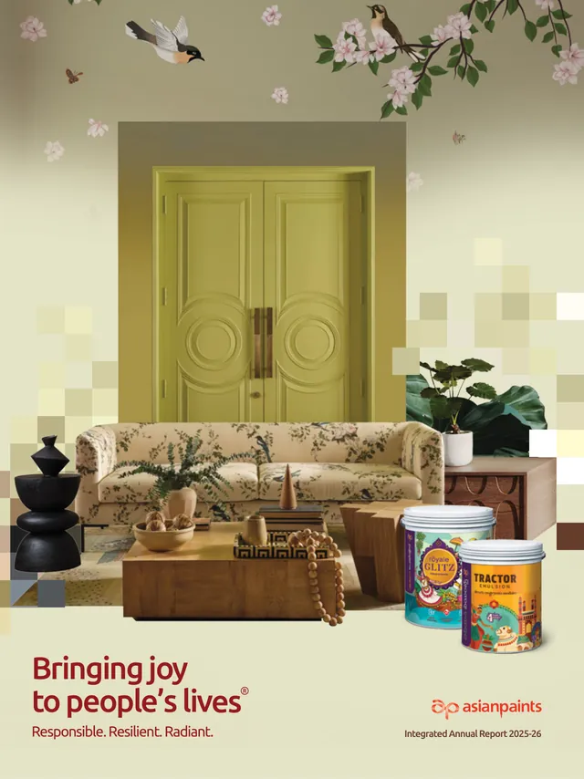
A styled living room with a green double door, a floral sofa, birds on a blossom wallpaper and two paint tins, Royale Glitz and Tractor Emulsion, with pixel squares breaking up the wall. It's unmistakably a paint company and beautifully art-directed. It also looks like a product catalogue, and the two lines of copy plus a registered trademark symbol make the type work harder than it should. (Asian Paints review)
Titan
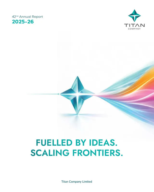
A white page, Titan's faceted star rendered as a crystal, and a ribbon of coloured light streaming from it, prism-style. The year and report number sit at top left where they're easy to find. It's the most restrained cover in the set after ICICI Bank's, and the back cover, a wall of Titan's brand logos, is one of the few that adds information. (Titan review)
Mahindra & Mahindra
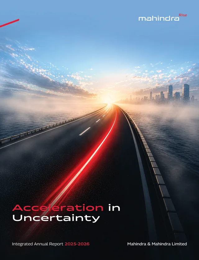
A road over water runs into mist and sunrise, a red light trail streaking along it, towards a skyline. The fog is the uncertainty and the light trail is the acceleration: a rare case of the picture making the same point as the words. "Acceleration" is set in Mahindra red, which ties the two together. (Mahindra review)
Hero MotoCorp
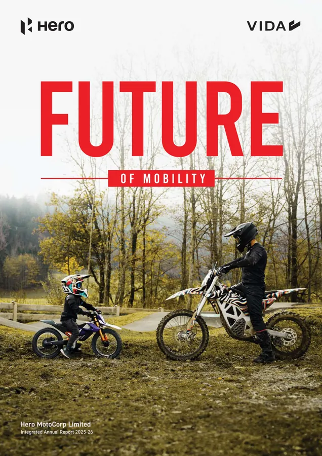
"FUTURE" in huge red condensed capitals over a woodland photograph of an adult and a child on off-road bikes, with the Hero and VIDA logos at the top. It's the loudest cover in the set and one of the most legible. The parent-and-child pairing is a quiet way of saying "future" without a single robot. The company name and year are tiny, at the bottom left.
Sun Pharma

Rounded, capsule-like frames holding photographs (a father and son, a scientist at a microscope, a researcher with a tablet, a smiling couple, glass vials) with a DNA helix drawn across them. The capsule shapes are a neat idea. The photographs look like stock, and the seven-word line, with "Globally" and "Patient Care" picked out in orange, doesn't read at small size. (Sun Pharma review)
Tata Steel
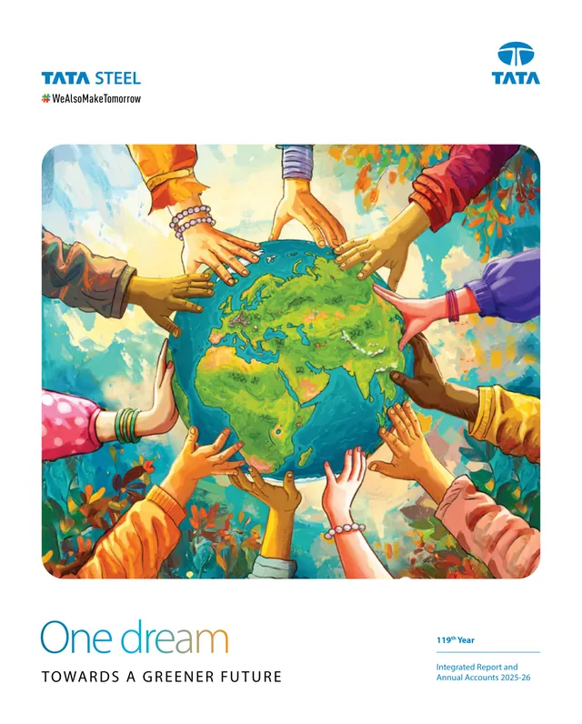
A hand-painted illustration of many hands, with bangles and bracelets, holding up a green globe against autumn-coloured foliage. Illustration is a welcome change from photography in a steel report, and the painting has warmth. But hands-around-the-globe is a well-worn image, and nothing on the page says steel or decarbonisation, which is what "greener future" means for this company. (Tata Steel review)
JSW Steel

Polished steel rings orbit a chrome globe showing India, with values engraved on the rings: future-focused, partnerships, fortitude, courage, determination, growth. The material is the product, and "Mettle" is a pun only a steel company can make. Our one complaint is size: the letter-spaced title at the foot of the page and the report name at the top right both shrink to nothing in a thumbnail.
Hindustan Zinc

"HZL" in heavy blue capitals sits above a huge white "2.0" cut out of a green-to-violet panel, with a heron perched on the zero. Inside the panel are a figure in a VR headset, a robotic arm, a drone, an AI chip, wind turbines, solar panels and an electric car at a charger. "2.0" is a bold, ownable idea and reads at any size, but the panel is a catalogue of future symbols with no zinc or silver in it, and the line "Leading the Way to a Better Future" is too small and too general to add anything. (Hindustan Zinc review)
Zee Entertainment
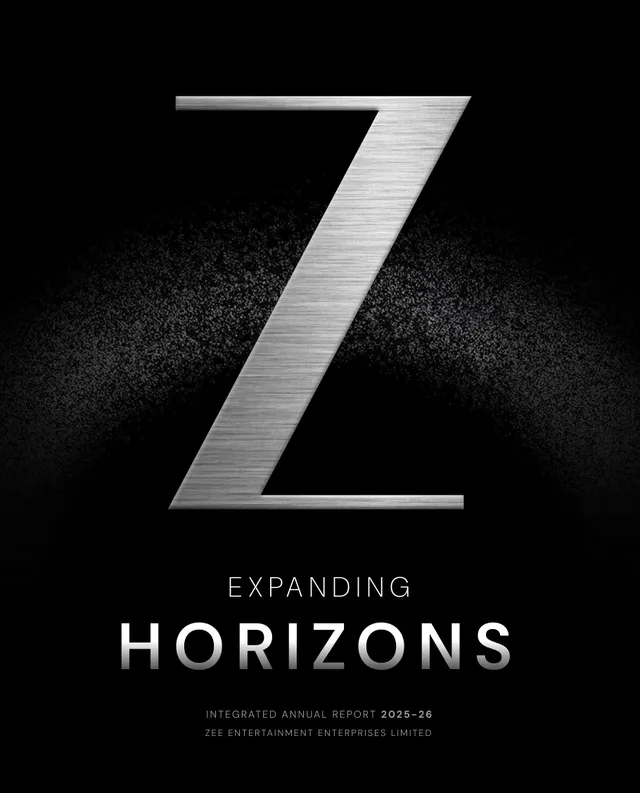
A brushed-steel "Z" on black, a haze of grain glowing behind it like a horizon, and "Expanding Horizons" in widely spaced white capitals underneath. It's the boldest single-image cover in the set and the one most like a film title card, which suits a media company. The back cover closes with "Yours Truly," above a small steel Z. The only thing a thumbnail loses is the report name and year, set in very small type at the foot of the page.
Dr. Reddy's

Circles of photography (a DNA strand, a nurse embracing a patient, a worker in protective gear packing a box, a lab worker, a molecule) float with dots in the brand's purple, blue, yellow and green, echoing the dot cluster in the logo. The company name, the report title and "FY 2025-26" are the largest type on the page, which makes this the easiest cover in the set to identify. The photographs are generic healthcare imagery, and two lines compete: "Strengthening the Core. Building the Future." in the middle and the brand line "Good Health Can't Wait." at the bottom.
The comparison table
| Company | Style | Cover line | What works | What doesn't |
|---|---|---|---|---|
| TCS | 3D illustration | Leadership in Enterprise AI: Infrastructure to Intelligence | Image is the theme, bottom to top | Line too small; AI blue |
| Infosys | Typographic | Unlock AI Value | "AI" built into the title | Shares palette with other AI covers |
| LTM | Typographic | It's time to Outcreate | Clear hierarchy; ownable word | Coined word asks the reader to buy in |
| ICICI Bank | Typographic, minimal | Empathy | One word, brand colour, legible at any size | Little to fault |
| HDFC Bank | 3D render | Harnessing AI in Banking | Red brackets echo the logo | Generic "digital" imagery |
| SBI | Photo montage | Digital First, Customer First, Nation Always | Specific detail (Tawang branch) | Three slogans, two emblems, many images |
| Bajaj Finance | Archive photo grid | 100 Years of Bajaj | A century of real photographs | Two numbers compete; robot tile |
| ITC | Logo-shaped collage | Enduring Value / Nation First: Sab Saath Badhein | Breadth of business in one shape | Brand signature, not the year's theme |
| HUL | Advertising photography | Powering a Nation on the Rise | Recognisably HUL; line is legible | Images and line say different things |
| Britannia | Composite scene | Building for the Future | Giant "B" as a frame | Busy scene; repetitive subline |
| Bharti Airtel | Logo as photo window | Customer Obsessed. Connectivity & Beyond | Logo as frame; line reads well | Every business line in one window |
| L&T | Line drawing with cut-outs | Every great story begins with a leap. | Blueprint suits the company; back cover continues it | Line lost among objects |
| Adani Ports | Photo-mosaic portrait | Accelerating Infrastructure, Leveraging Intelligence. | Striking at full size | Line shared with Adani Enterprises; icon row |
| Asian Paints | Styled interior | Bringing joy to people's lives | Unmistakably paint | Reads as a catalogue; two lines plus ® |
| Titan | Minimal, rendered symbol | Fuelled by Ideas. Scaling Frontiers. | Restraint; year easy to find | Two-sentence line is long for a thumbnail |
| Mahindra | Photographic landscape | Acceleration in Uncertainty | Picture and words make one point | Year and name small |
| Hero MotoCorp | Photograph with big type | Future of Mobility | Loud, legible, human | Name and year tiny |
| Sun Pharma | Photo collage | Advancing Innovation Globally for Better Patient Care. | Capsule-shaped frames | Stock-looking photos; long line |
| Tata Steel | Painted illustration | One dream: towards a greener future | Illustration stands out among steel reports | Familiar image; no steel in it |
| JSW Steel | 3D render | A Different Mettle | Material is the product; ownable pun | Type too small at thumbnail size |
| Hindustan Zinc | Illustrated panel with big type | HZL 2.0: Leading the Way to a Better Future | "2.0" is bold and ownable | Generic future icons; no zinc or silver |
| Zee Entertainment | Rendered symbol, minimal | Expanding Horizons | One image, title-card confidence; back cover signs off | Report name and year very small |
| Dr. Reddy's | Photo circles | Strengthening the Core. Building the Future. | Name and year set large, easy to find | Stock-looking photos; two lines compete |
A checklist for briefing your agency on the cover
- Agree the messageFinish “This year, we want readers to understand that…” before concepts begin.
- Choose an ownable imageBrief the material, product, mark, archive or place a peer cannot simply borrow.
- Set the hierarchyCompany, one main line, report type and year. Decide what belongs inside.
- Test the real usesFull size, 120 px wide, phone and one-colour reproduction.
- Finish the whole objectGive the back cover a job and keep the approval group small.
Editorial review checklist distilled from this article. Apply it alongside the 23 real cover examples and the full briefing checklist below.
Cover decisions are usually made late and by committee, which is how covers end up with three slogans. Settle these points in the brief, before the first concepts arrive. Our guide to choosing an annual report theme covers the step before this one.
- Write the one-sentence message first. "This year, we want readers to understand that…". The cover line compresses it. If the sentence isn't agreed, no layout will rescue the cover.
- Ask for one line, not two. A theme plus a subline plus a brand tagline is three messages. Decide which one the cover carries; the others can go inside.
- Specify the thumbnail test. Every concept should be presented at full size and at 120 pixels wide. The company name and the theme should be readable at both sizes.
- Put the year where people look. Name the report type and financial year in the brief ("Integrated Annual Report 2025-26") and ask for it to be findable in a second.
- Ban the generic. List the images you don't want: glowing data cubes, hands around a globe, smiling stock families, lab coats, light trails into a skyline (unless, like Mahindra, it's the whole idea).
- Ask what only you could show. Your material, your product, your logo, your archive, your places. JSW's steel, Titan's star, Bajaj's archive and SBI's Tawang branch are all things a competitor couldn't use.
- Check peers' covers. Collect last season's covers from your sector before concepts. If yours could swap logos with a competitor's, start again.
- Brief the back cover too. Decide what it does: QR codes to the digital report and channels, a brand portfolio, the end of the cover story, or the registered office details at minimum.
- Test in one colour and on a phone. The cover will appear in black-and-white printouts, in exchange filings and on small screens.
- Agree who signs off, and limit the number of people. Fewer approvers, fewer additions. The CEO and CFO should approve the line; the design itself needs a small group.
If you're choosing who will design the next report, our comparison of annual report agencies in India and our note on why annual report design matters are good next reads.
Frequently asked questions
What makes a good annual report cover?
One idea, expressed in a short line and an image that belongs to the company. The company name and the reporting year should be easy to find, and the cover should still be recognisable when it is shrunk to a thumbnail on a search page, an exchange filing list or a social post. Among Indian FY 2025-26 reports, ICICI Bank, Zee Entertainment, LTM, JSW Steel, Titan and Hero MotoCorp are good examples.
Is there a regulatory requirement for what goes on an annual report cover in India?
No. The Companies Act, 2013 and SEBI's LODR Regulations set out what the annual report must contain, but neither prescribes the cover. In practice the cover carries the company's name, the type of report (annual report, integrated annual report, report and accounts) and the financial year, and the theme line is an editorial choice.
Should an annual report cover use photographs or illustration?
Either works if the image is specific. HUL's and Hero MotoCorp's covers use photography; L&T and Tata Steel use illustration; JSW Steel and Titan use rendered objects. The failures in our set are images that any company could use, such as generic families, lab coats, glowing data cubes or hands around a globe.
How long should the theme line on a cover be?
Short enough to read at 120 pixels wide, which in our test meant roughly one to four words in large type. ICICI Bank's 'Empathy', Zee's 'Expanding Horizons' and Hero MotoCorp's 'Future of Mobility' pass easily. Lines with two clauses, or a main line plus a subline, tend to lose the second part at small sizes.
Does the back cover matter?
It is the second most-seen page of a printed report and the last page of the PDF. ITC's back cover carries QR codes to its website and social channels, Titan's shows its brand portfolio, L&T's finishes the 'leap' story in four lines, Zee's signs off with 'Yours Truly,' above a small version of the cover's Z, and TCS uses it for its safe harbour statement. Several PDFs we downloaded simply end on a notes page or an AGM table, which wastes the space.
Which Indian FY 2025-26 annual report has the best cover?
On our reading, ICICI Bank's: one word, the brand colour, a fabric texture and nothing else, and it is the most legible cover of the 23 at thumbnail size. Zee Entertainment, LTM, JSW Steel and Titan are close behind.
Sources
- TCS Integrated Annual Report 2025-26 — Tata Consultancy Services
- Infosys Integrated Annual Report 2025-26 — Infosys
- LTM Integrated Annual Report 2025-26 — LTM
- ICICI Bank Annual Report 2025-26 — ICICI Bank
- HDFC Bank Integrated Annual Report 2025-26 — HDFC Bank
- State Bank of India Annual Report 2025-26 — State Bank of India
- Bajaj Finance 39th Annual Report 2025-26 — Bajaj Finance
- ITC Report and Accounts 2026 — ITC
- Hindustan Unilever Integrated Annual Report 2025-26 — Hindustan Unilever
- Britannia Industries Annual Report 2025-26 (filed with the stock exchanges) — Britannia Industries / National Stock Exchange of India
- Bharti Airtel Integrated Report and Annual Financial Statements 2025-26 — Bharti Airtel
- Larsen & Toubro Integrated Annual Report 2025-26 — Larsen & Toubro
- Adani Ports and SEZ Integrated Annual Report 2025-26 — Adani Ports and Special Economic Zone
- Asian Paints Integrated Annual Report 2025-26 — Asian Paints
- Titan Company 42nd Annual Report 2025-26 — Titan Company
- Mahindra & Mahindra Integrated Annual Report 2025-26 — Mahindra & Mahindra
- Hero MotoCorp Integrated Annual Report 2025-26 — Hero MotoCorp
- Sun Pharma Annual Report 2025-26 — Sun Pharmaceutical Industries
- Tata Steel Integrated Report and Annual Accounts 2025-26 — Tata Steel
- JSW Steel Integrated Report 2025-26 (filed with the stock exchanges) — JSW Steel / National Stock Exchange of India
- Hindustan Zinc Integrated Annual Report 2025-26 — Hindustan Zinc
- Zee Entertainment Enterprises Integrated Annual Report 2025-26 (filed with the stock exchanges) — Zee Entertainment Enterprises / National Stock Exchange of India
- Dr. Reddy's Laboratories Integrated Annual Report 2025-26 (filed with the stock exchanges) — Dr. Reddy's Laboratories / National Stock Exchange of India